I'm in the process of re-formatting my books for print. I'm using a different software and unfortunately, it doesn't allow me to import the font that I licensed for my current print books. So I'm trying to decide which of the fonts offered by this software will best suit my books. I want the font to be readable and also to fit the overall tone of my books, so the lighter, more playful fonts are out.
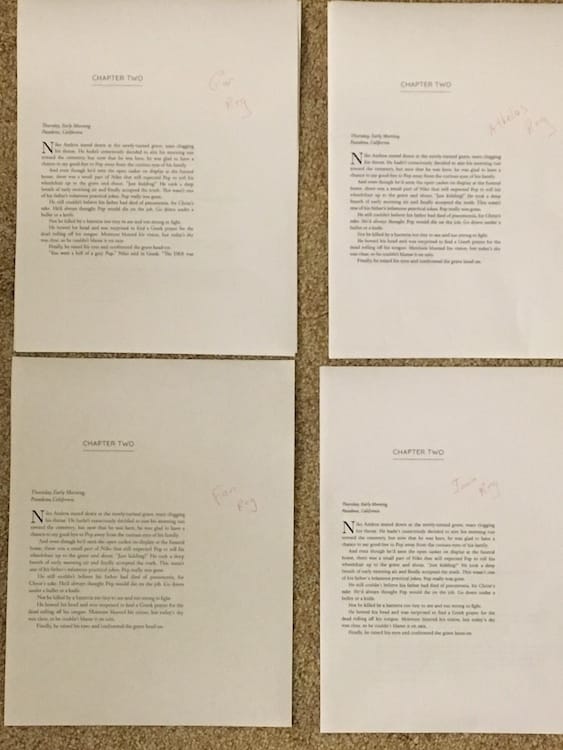
To do this, I printed out samples of all of the fonts and then began narrowing down my choices.

I don’t know if you can see from the photo, but there’s not a whole lot of difference between some of the fonts. The differences are very nuanced, such as how close the letters are to one another and the thickness of the parts of each letter. A couple of the fonts draw the curve of the P so that it doesn't touch back to the stem, unlike this font I'm writing this blog post in. I decided against those for style reasons.
I finally narrowed it down to one that I think I want to use. The next step is to print out several pages to make sure I find it readable across a longer range of text.
This is the type of decision I never expected to have to make when I decided to become a writer, but fortunately, I find it interesting, if a bit frustrating and time-consuming.

